On this page · 15 sections
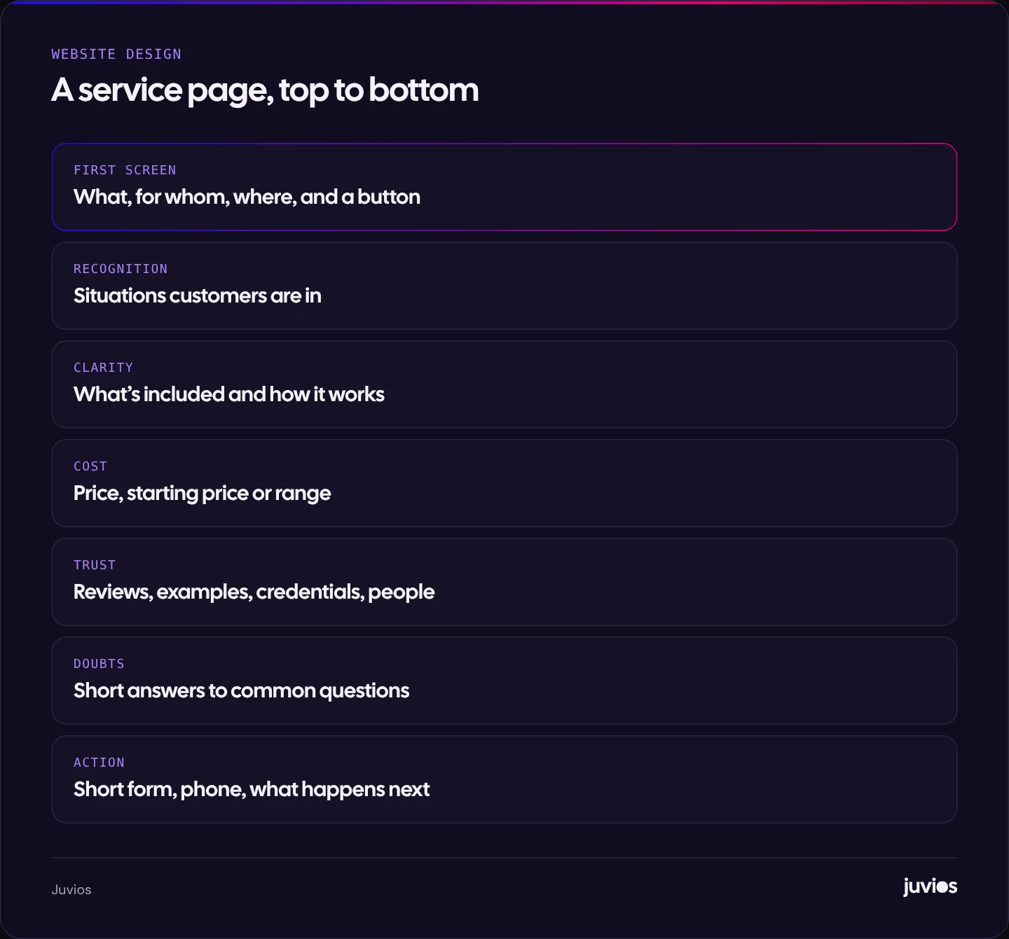
A service page that gets enquiries answers a visitor’s questions in the order they ask them. First: is this what I need, and do you cover me? Then: what exactly do I get, roughly what will it cost, and can I trust you? Finally: what happens if I get in touch, and how do I do it? Give each service its own page, put a clear headline and next step on the first screen, show a price or price guide, back it up with real proof, answer the common doubts, and make the form short. This guide walks through each section with examples, then covers layout, search basics and how to measure whether the page works.
Give each service its own page
Many small business sites list every service on one page. That’s convenient to build, but it makes every visitor dig for the part that matters to them, and it makes it hard to rank in search or run focused ads.
A separate page for each main service lets the headline name exactly what someone searched for, lets you explain that service properly, and gives ads a matching place to land. If you run Google Ads for “emergency plumber”, the page should be about emergency plumbing, not plumbing in general.
Group small or closely related services where it makes sense. The test is whether customers think of them as one thing. “Boiler servicing and repair” may be one page; “boiler installation” is usually another, because the customer’s situation and budget are different.
The first screen: what, for whom, and what next
The first screen on a phone decides whether people stay. It needs to tell them, in plain words, that they’re in the right place, and show them the next step.
| Weaker | Stronger | Why |
|---|---|---|
| Excellence in every project | Kitchen fitting in Bristol, from design to final tile | Names the service and the area |
| Your trusted partner | Bookkeeping for small businesses, fixed monthly fee | Says who it’s for and removes a price worry |
| Welcome to our services | Same-week garden clearance, fixed quote before we start | States the benefit and removes a worry |
- Headline: the service, and the area or audience if it matters.
- One supporting line: the main benefit or what makes you different.
- A primary button: “Get a quote”, “Book an assessment” or similar. Use words that describe what happens.
- A small trust cue: a review rating with its source, years in business, or a recognisable accreditation you genuinely hold.
Show you understand the situation they’re in
People rarely search for a service in the abstract. They search because something has happened: a leak, a new business, a tax deadline, a website that brings no enquiries. Describe those situations in their words.
A short list of “You might need this if…” points works well. It helps visitors recognise themselves, and it naturally includes the language people search with, which helps the page match more searches without forcing keywords.
Look at your enquiry emails and phone notes for the phrases customers use. “My boiler keeps losing pressure” is more useful on a page than “comprehensive heating solutions”.
Explain what’s included and how it works
Uncertainty stops people enquiring. Describe what the service includes, what it doesn’t, and the steps from first contact to finished job.
- First contact: what happens when they enquire, and how quickly you reply.
- Assessment or quote: a visit, a call or an online form, and whether it’s free.
- The work itself: main stages and roughly how long each takes.
- Finish and aftercare: guarantees you genuinely offer, follow-up, support.
Be specific about what’s not included, too. It prevents awkward conversations later and makes the price easier to trust.
Show a price, a starting price or a range
Many service businesses hide prices because every job is different. But a visitor who can’t find any idea of cost often assumes it’s expensive, or leaves to find a business that does show prices.
| Approach | Works when | Example |
|---|---|---|
| Fixed price | The service is standard | Annual boiler service: fixed price |
| Starting price | There’s a basic version and options | Websites from a set package price |
| Typical range | Jobs vary but follow a pattern | Most bathroom refits fall within a stated range |
| Worked example | Pricing is a formula | A 20% management fee on a US$1,000 ad budget is US$200 |
| How we price | Every job is genuinely bespoke | Explain what affects the price and how quotes work |
Even a range filters out people who were never going to buy, and reassures the ones who can afford it. That improves the quality of enquiries as well as the number.
Proof: reasons to believe you
Every claim on the page is easier to believe with evidence. Use what you genuinely have.
- Reviews: real ones, with a name or business and the source, such as Google. Pick reviews that mention this specific service.
- Examples of work: photos, before-and-after pairs, short project summaries.
- Credentials: accreditations, memberships, insurance and qualifications you actually hold.
- People: who will do the work, with a photo. Small businesses have an advantage here.
- Numbers you can stand behind, such as years trading or jobs completed, if you’ve counted them.
Never invent reviews, logos or results. Apart from the legal and platform risks, visitors are good at spotting proof that feels fake, and it undermines everything else on the page.
Answer the doubts that stop people enquiring
Most visitors have one or two worries that stop them getting in touch. A short set of questions and answers near the bottom of the page deals with them.
- Cost: “Is the quote free?” “Are there extra charges?”
- Commitment: “Is there a contract?” “Can I cancel?”
- Timing: “How soon can you start?” “How long does it take?”
- Fit: “Do you work with businesses like mine?” “Do you cover my area?”
- Process: “What do I need to prepare?” “What happens after I enquire?”
Keep answers short and specific. If an answer needs a long explanation, it may deserve its own section higher up the page, or a blog guide linked from the page.
The enquiry form and other ways to get in touch
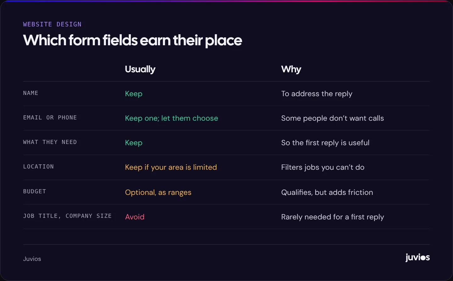
The form is where all the work on the page pays off, and where a lot of visitors give up. Keep it as short as you can while still getting what you need to reply usefully.
| Field | Usually | Why |
|---|---|---|
| Name | Keep | You need to address the reply |
| Email or phone | Keep at least one; let them choose | Some people prefer not to be called |
| What they need | Keep, as a short text box or a few options | Lets you reply with something useful |
| Location or postcode | Keep if you cover a limited area | Filters enquiries you can’t serve |
| Budget | Optional; offer ranges | Helps qualify, but can put people off |
| Company size, job title, how did you hear | Avoid unless essential | Each extra field adds effort |
 Tap to enlarge
- Label every field clearly, above the box, not just as placeholder text that disappears.
- Say what happens next, near the button: who replies, how and when.
- Show a clear confirmation after submitting, and send an automatic email confirmation.
- Offer other routes: a tappable phone number, and messaging or booking if you use them.
- Protect the form from spam without making people solve puzzles.
Layout: easy to scan on a phone
Most visitors scan before they read. Use descriptive headings so someone scrolling can find the part they care about, short paragraphs, and lists for steps and inclusions.
- Repeat the main button after each major section, so nobody has to scroll back up to act.
- Keep the page fast: compressed images, no heavy sliders, and nothing that jumps around as it loads.
- Make sure text has enough contrast and buttons are large enough to tap.
- Avoid pop-ups that cover the content on mobile, especially as soon as the page opens.
- On phones, consider a slim bar fixed to the bottom of the screen with call and enquire buttons.
 Tap to enlarge
Speed matters for both visitors and search. How to improve Core Web Vitals explains the fixes that help most.
Search basics for service pages
A well-written service page is already most of the way to good search visibility, because it clearly answers what people are looking for. A few technical basics complete it.
- A unique title tag and H1 that name the service, and the area if you serve one.
- A meta description that summarises the offer and gives a reason to click.
- A short, readable URL, such as /services/kitchen-fitting.
- Links to the page from your homepage, navigation and related blog posts, and links from the page to related services.
- For local businesses, consistent name, address and phone details, and a complete Google Business Profile. Google says local results are based mainly on relevance, distance and prominence.
If several service pages are being rebuilt as part of a redesign, plan redirects from old URLs before launch. Our website redesign SEO guide covers how.
Measure whether the page works
Track enquiries by page, so you know which service pages bring in work and which need improvement. In analytics, record a key event for each successful form submission and each tap on the phone number, and look at them by landing page.
Compare visits and enquiries for each service page each month. A page with plenty of visits and few enquiries is a page to improve: check the first screen, the price information and the form. A page with good conversion but few visits needs more traffic, through search, internal links or ads.
If enquiries are low across the whole site, start with why your website isn’t generating leads, which works through the problem in a sensible order.
A worked example: rewriting a weak page
Here’s a hypothetical before and after for a small electrical contractor’s page about EV charger installation.
Before: the page is titled “Services”, opens with a large stock photo and the line “Quality electrical solutions for all your needs”, and lists eleven services in one paragraph. EV chargers are mentioned once. There are no prices, one generic testimonial and a contact page link at the bottom.
- New page just for EV charger installation, linked from the homepage and navigation.
- First screen: “Home EV charger installation in Leicester, usually within two weeks”, a “Get a quote” button and the Google review rating.
- Situations: new electric car, charger from the car dealer needs fitting, older charger needs replacing.
- What’s included: survey, installation, testing, certificate, a short walkthrough of the app.
- Price: a typical installed price range, and what can add to it, such as a long cable run.
- Proof: photos of recent installations and three reviews that mention chargers.
- Questions: grants, how long it takes, whether the fuse box needs upgrading.
- Form: name, phone or email, postcode, car model, preferred timing.
The contractor then tracks enquiries from the new page for two months and compares them with the old services page. If visits rise but enquiries don’t, the next things to test are the price range and the form.
Nothing here needs a bigger budget. It needs decisions about what to say and in what order, which is exactly what the page was missing.
Service page checklist
- One main service per page.
- First screen names the service, the audience or area, and the next step.
- Situations customers are in, in their words.
- What’s included, what isn’t, and the steps.
- A price, starting price, range or clear explanation of pricing.
- Real proof: reviews, examples, credentials, people.
- Short answers to common doubts.
- A short, labelled form, with what happens next.
- Phone and other contact options.
- Fast and readable on a phone.
- Unique title, H1 and description, and internal links.
- Enquiries tracked by page.
Common questions
How long should a service page be?
Long enough to answer the questions customers ask before enquiring, and no longer. For many services that’s several hundred to over a thousand words, broken into short sections with clear headings.
Should I put prices on my service pages?
Usually, yes. A fixed price, starting price or typical range helps visitors decide and filters out poor-fit enquiries. If every job is bespoke, explain what affects the price.
Is a contact page enough, or does each service page need a form?
Put a form or a clear enquiry button on each service page. Sending people to a separate contact page adds a step where some will drop off.
Sources
- Website Forms Usability: Top 10 Recommendations Nielsen Norman Group
- Labeling Controls (forms tutorial) W3C Web Accessibility Initiative
- Search Engine Optimization (SEO) Starter Guide Google Search Central
- Tips to improve your local ranking on Google Google Business Profile Help