On this page · 16 sections
Three shapes cover almost everything a small business posts on Instagram, Facebook and TikTok: portrait 4:5 for feed posts (1080 × 1350 pixels), vertical 9:16 for Stories, Reels and TikTok (1080 × 1920), and square 1:1 (1080 × 1080) as a fallback that works almost anywhere. Design key text and logos inside a central safe area so app buttons and captions don’t cover them, export photos as JPG and text-heavy graphics as PNG, and check the platforms’ own specification pages before a big campaign, because details change. This guide explains each shape, when to use it, and the deliverables to ask a designer for.
Aspect ratios in plain terms
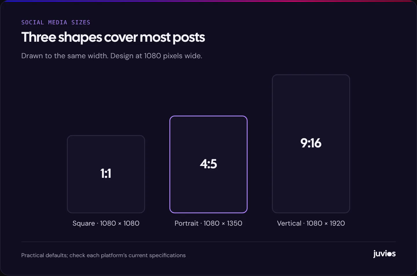
An aspect ratio is the shape of an image: its width compared with its height. A 4:5 image is slightly taller than it is wide. A 9:16 image is tall and narrow, the shape of a phone screen held upright. A 1:1 image is square.
Different ratios can share a width. A 1080-pixel-wide square is 1080 tall, a 4:5 portrait is 1350 tall and a 9:16 vertical is 1920 tall. Designing all three at the same width makes it easy to adapt one design into the others, because text and logos stay the same size.
The ratio matters more than the exact pixel size, because platforms scale images to fit the screen. The pixel size matters for sharpness: too small and the image looks soft, much too large and the file is slow to upload without looking any better. Designing at 1080 pixels wide is a common, practical standard for social feeds.
 Tap to enlarge
The shapes to design for
| Placement | Shape | Design size (pixels) | Notes |
|---|---|---|---|
| Instagram feed post | Portrait 4:5 | 1080 × 1350 | Takes up more of the screen than square; check how your profile grid crops it |
| Facebook feed post | Portrait 4:5 or square 1:1 | 1080 × 1350 or 1080 × 1080 | 4:5 shows larger on mobile feeds |
| Instagram and Facebook Stories | Vertical 9:16 | 1080 × 1920 | Keep text clear of the top and bottom |
| Instagram and Facebook Reels | Vertical 9:16 | 1080 × 1920 | Captions and buttons sit over the lower part of the video |
| TikTok in-feed video | Vertical 9:16 | 1080 × 1920 recommended in practice; TikTok’s minimum is 540 × 960 | Native, sound-on video |
| Carousel slides | Portrait 4:5 or square 1:1 | 1080 × 1350 or 1080 × 1080 | All slides in one carousel share the same shape |
| Link preview (sharing a web page) | Landscape about 1.91:1 | 1200 × 630 | Set on your website, not in the post |
Feed posts: why portrait usually wins
On a phone, a portrait 4:5 image fills more of the screen than a square or landscape one. More screen space gives your post more time to catch attention as people scroll. That’s why 4:5 has become the default shape for feed posts on Instagram and a strong choice on Facebook.
Square still has its place. It works in almost every placement with little cropping, which makes it useful when one design must serve many places, or when your layout is naturally square, such as a product on a plain background.
Watch the profile grid
Instagram shows a cropped preview of each post on your profile grid, and the shape of that preview has changed over time. Before you commit to a layout, upload a test post to a private account, or check a recent post on your profile, to see how much of the top and bottom is cut off. Keep the main subject and any headline in the middle.
Stories, Reels and TikTok: designing for full-screen vertical
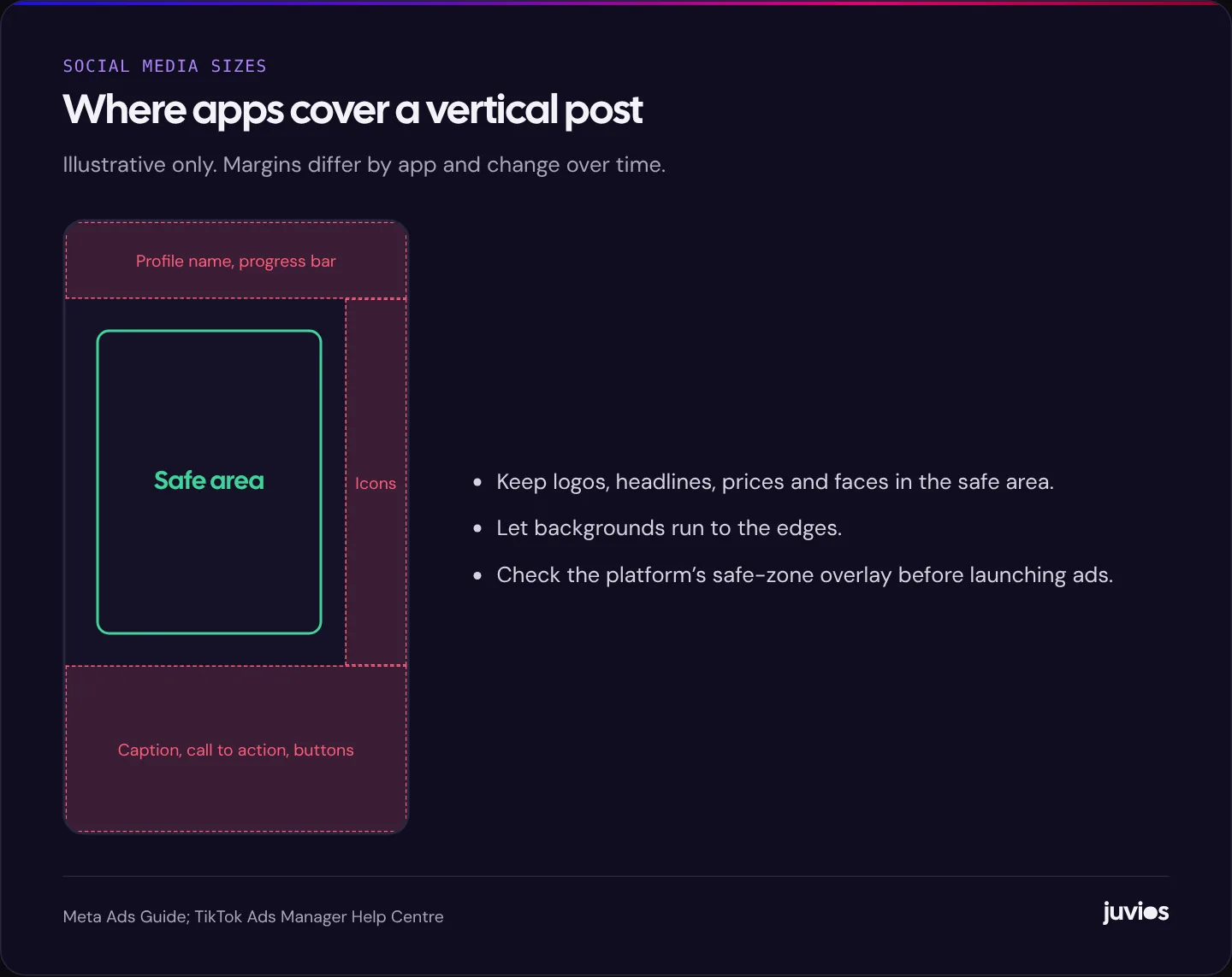
Vertical 9:16 fills the whole phone screen. It’s the native shape for Stories, Reels and TikTok, and increasingly common in ads. It’s also the shape where the app places the most on top of your design: profile names and progress bars at the top, captions, buttons and calls to action at the bottom, and icons down the right-hand side.
Keep logos, headlines, prices and faces inside a central safe area, away from the top and bottom edges and the right-hand side. Meta’s Ads Guide and TikTok’s specifications both show where interface elements sit. The exact margins differ by app and change over time, so use their current guides or overlays when designing an important ad.
 Tap to enlarge
Carousels
Carousels let people swipe through several images or videos in one post. They suit step-by-step tips, before-and-after sequences, product ranges and anything with a natural order.
- Make the first slide work on its own. Many people will only see that one, so it needs a clear headline and a reason to swipe.
- Keep every slide in the same shape. Mixed shapes get cropped to match.
- Use a consistent layout across slides so the set reads as one piece, with a small cue such as an arrow or slide number to encourage swiping.
- End with a slide that says what to do next.
Carousels also work as ads. Each card can show a different product or step, and people who swipe are showing real interest.
Video: more than a shape
For video, the shape is only one of several decisions. Most social video is watched on phones, often with the sound off, and often only for the first few seconds.
- Film vertically when the main use is Stories, Reels or TikTok. Cropping a landscape video to vertical loses most of the frame.
- Put the hook in the first second or two: the problem, the result or something unexpected.
- Add captions. They help people watching with the sound off, and they make video accessible to people who are deaf or hard of hearing.
- Keep text and captions inside the safe area.
- Make a cover image or first frame that works as a still on your profile grid.
- Export as MP4 with H.264 video and AAC audio, which all major platforms accept.
If you’re choosing between platforms for video ads, our comparison of Meta and TikTok ads explains how creative needs differ between them.
Link previews: the image people see when you share your website
When you or a customer shares a link to your website, platforms show a preview image pulled from your site. That image is set in your website’s code, using Open Graph tags, not in the post itself.
A landscape image of about 1200 × 630 pixels works well for most link previews. Make one for your homepage and each important page, with a clear headline and your logo, and check that it’s set. If you’ve ever shared a link and seen a random cropped photo or no image at all, the preview image is missing or the wrong shape.
Exporting files: formats and settings
| Content | Format | Why |
|---|---|---|
| Photos | JPG, high quality | Small files with good detail |
| Graphics with text, logos or flat colour | PNG | Keeps text and edges sharp |
| Video | MP4 (H.264 video, AAC audio) | Widely accepted across platforms |
| Animated graphics | MP4 rather than GIF | Smaller and better quality |
| Captions for video | Burned-in text or an SRT file where supported | Accessibility and sound-off viewing |
- Export in the sRGB colour profile, which is what phones and browsers expect. Other profiles can make colours look dull or shifted.
- Don’t upscale small images. A blurry 600-pixel photo stretched to 1080 still looks blurry.
- Keep the original, full-resolution files. Images saved back from social media are compressed and shouldn’t be reused for new designs.
Text that people can actually read
Most text problems on social posts come from designing on a large screen and posting to a small one. A headline that looks fine on a laptop can be tiny on a phone in a feed.
- Preview every design on a phone at actual size before posting.
- Keep on-image text short, a headline and perhaps one supporting line. Put the detail in the caption.
- Use strong contrast. The Web Content Accessibility Guidelines’ 4.5:1 minimum for normal text is a sensible test for small text on images.
- Avoid placing text over busy parts of a photo. Use a solid panel or a darker area of the image instead.
A consistent type and colour system makes this easier every time. See building a consistent look for your social media.
Deliverables to ask a designer for
Asking for “a post” leaves too much open. Ask for the specific versions you’ll use. A simple standard for small businesses is below.
| Content | Ask for | Used in |
|---|---|---|
| Each still post | 4:5 feed version and 9:16 story version | Feed and Stories |
| Each carousel | All slides in 4:5, first slide also as a 9:16 story teaser | Feed and Stories |
| Each video | 9:16 master, 4:5 cut, cover image, captions | Reels, TikTok, feeds, profile grid |
| Each ad concept | 4:5 and 9:16 versions, plus 1:1 if the campaign uses it | Feeds, Stories, Reels |
| Website pages | 1200 × 630 link preview image | Link sharing |
Put this list in your design brief so there’s no confusion about quantities. Our guide on how to brief a social media designer includes a template.
Design once, adapt well
Designing each post three times from scratch is slow. A better approach is to design one master and adapt it.
- Start with the portrait 4:5 version, with all key content inside a centred box that will also fit the 9:16 safe area.
- Extend the background up and down to make the 9:16 version, rather than stretching or cropping the content.
- Crop to 1:1 only if you need it, checking nothing important is lost.
- Use templates with these safe areas already marked, so every new post starts in the right place.
When you still need landscape
Vertical and portrait shapes dominate social feeds, but landscape 16:9 still has a place. Videos for your website, YouTube (other than Shorts) and presentations are usually landscape. So are some event and cover images.
If you plan to use one shoot for several destinations, film with both in mind. Shooting vertically gives you native Reels and TikTok, and you can often frame a landscape version from a separate take. Trying to crop one into the other usually loses either the subject or the context. For photos, leave space around the subject so the same image can be cropped to square, portrait and vertical without cutting anything important.
Check before you post
A minute of checking saves a post that looks broken in the feed. Before publishing, and always before launching an ad:
- Open the design on your phone at actual size. Can you read every word without zooming?
- Use the preview in the app or in Ads Manager to see each placement with the interface on top.
- Check that nothing important falls under buttons, captions or the profile name.
- Look at how it appears in your profile grid or as a cover frame.
- Watch videos with the sound off. Does the message still come across?
Ads Manager on both Meta and TikTok shows previews for each placement. If a placement crops your design badly, provide a version made for that shape, or remove the placement from the ad set rather than letting it run with a broken layout.
Common mistakes
- Posting a landscape image to Stories, which leaves large empty bars or crops the subject.
- Text under the like button or caption on Reels and TikTok.
- Using one square design everywhere when portrait and vertical would perform better.
- Tiny text designed on a desktop screen.
- Reusing compressed images downloaded from social media.
- Forgetting the link preview image on the website, so shared links look broken.
Common questions
What is the best size for an Instagram post?
For most feed posts, portrait 4:5 at 1080 × 1350 pixels. It takes up more of the screen than square. Keep key content in the middle so the profile grid preview doesn’t cut it off.
Can I use the same image for Instagram and Facebook?
Yes. A 4:5 feed image works on both, and a 9:16 version works for Stories on both. Check text placement in each app before posting.
Why does my image look blurry after uploading?
Usually because it was too small to start with, saved in a heavily compressed format, or exported in a colour profile phones don’t expect. Start with a 1080-pixel-wide design, export as high-quality JPG or PNG in sRGB.
Sources
- Meta Ads Guide Meta
- TikTok auction in-feed ads specifications TikTok Ads Manager Help Centre
- Instagram Help Centre: photo resolution Instagram
- The Open Graph protocol ogp.me
- Understanding Success Criterion 1.4.3: Contrast (Minimum) W3C Web Accessibility Initiative